
GrocerEase
This is a case study from the Google UX Certification that I am currently working on. We were tasked with creating an app from given prompts. The prompt I chose was "design an app and a responsive website for a local grocery store that helps shoppers locate products as they shop in person."
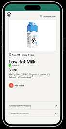
My roles included UX Designer and Researcher and UI Designer. So far, I have created wireframes, mockups, low-fidelity prototypes. The platforms I am using are Figma (to create mockups and prototypes) and Zoom (to conduct usability studies). I am in the process of creating high-fidelity prototypes for the app and my progress is shown below.

The Problem
Grocery store shoppers struggle to find products in-store in time efficient manner, leading to frustration.
The Goal
Design an app that improves the in-store shopping experience by helping customers quickly locate products in a local grocery store.
Understanding the User
User research, Personas, Problem statements, User journey maps
Summary
I interviewed participants to gain insights on their in-person grocery store shopping experiences. From these interviews, I created user personas, user stories, an empathy map, and a user journey map to gain an understanding of who they are and their pain points.
Personas
To get a better understanding of users, I created two personas.


Pain Points
1
Product location
Shoppers do not have knowledge of the store layout and spend too much time trying to locate products
2
Product information
Specific product information is only found in the store
3
Availablility
Shoppers do not know the product availability status before searching through the store which can lead to frustration
4
Shopping lists
Shoppers have to write down their shopping list without seeing the specific items sold at the store
Competitive Audit
To identify ways to improve the app, I conducted a competitive audit of similar companies, including Publix, Kroger, Instacart, and Target. The audit revealed what competitors do well and where they fall short.
From the audit, I was able to identify opportunities to improve the functionality, user experience, and overall effectiveness.
Starting the Design
Paper wireframes, Digital wireframes, Low-fidelity prototype, Usability studies

User Flow
Before the design, I mapped out the user flow. This way I can visualize how a user will move through the app.
Wireframes


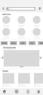
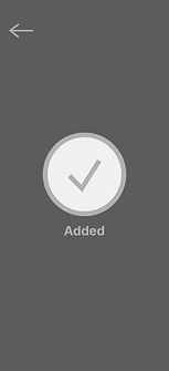
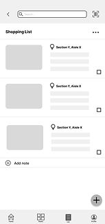
First, I sketched out the wireframes. I played with different layouts and elements until I found the right one to turn into digital wireframes in Figma. From the wireframes, I was able to create a low-fidelity prototype that represented what the structure, flow, and core functionality of the app
Low-Fidelity Prototype





Usability Studies
I conducted two usability studies to gather insights. The first was conducted to guide the design from wireframes to mockups. The second was conducted with a high-fidelity prototype for further iteration.
Round 1 Findings
1
Users need more imagery and labels.
Round 2 Findings
1
Users need labels on the icons.
2
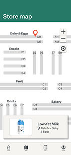
Users need an in-store map to locate products.
2
Users need alternative navigation routes.
3
Users were overwhelmed with the amount of choices.
3
Users liked the graphics and colors (user-friendly).
Refining the Design
Mockups, High-fidelity prototype, Accessibility
Mockups
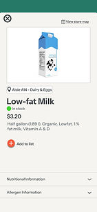
After conducting the first round of usability testing, I iterated my design many times using the insights gathered from participants. I explored new ways that I could enhance the user experience through visual styles like iconography, shape, white space and the overall usability.






High-Fidelity Prototype



Accessibility Considerations
To make sure the app was accessible to everyone...
1
When designing the icons, I included labels to clarify their functions. Because icons can be subjective, adding text helps users quickly and confidently understand each action.
2
I ensured all text met accessible contrast standards so it is readable for users with low vision.
3
The navigation is intuitive and accessible to all users. The design elements provide clear labeling and visual cues that make it easy for users to navigate through the app.
For more on the process, check out my presentation!